
Climate Clock: How It Was Designed
I approached Climate Clock with a singular philosophy: You should be able to get your weather as quickly and easily as possible.
When it comes to weather apps, I don’t need unnecessary taps or gestures. I don’t want frills or need to unlock achievements. A weather app should be like a well-designed tool: make it easy, make it elegant, give me what I want and let me get on with my day.
But first, why build an app to replace Apple’s default weather app? You might already be familiar with the built-in weather app’s pitfalls. If not, you can expand the below section for a quick rundown:
4 Pitfalls of Apple's Built-In Weather App
According to Apple’s weather app icon, it’s always 73 and sunny.
![]()
Why hasn’t Apple ever made this icon dynamic? The stock calendar app updates its icon. However, unlike the calendar app, the weather icon would have to actively poll and get the user’s current weather. That means creating a weather server behind the scenes, sending millions of weather updates to millions of iDevices. I’m sure that wouldn’t be that difficult for Apple, but I’m guessing it just isn’t a priority.
2. Yahoo! weather data.
Yahoo! Weather: The best, most accurate data service ever™. Actually, not really. I can’t count the number of times Yahoo! said it was 10 degrees warmer than every other major weather service.
In fact, it doesn’t even seem like Yahoo.com uses Yahoo! weather data – they use The Weather Channel. Often the data on Yahoo.com doesn’t match up with the data on Apple’s weather app. Strange.
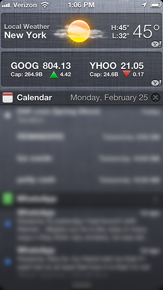
3. Notification center weather is wrong. I love being able to swipe from the top of my iPhone’s screen to get the current weather. It’s really quick and convenient. Unfortunately, the notification weather doesn’t seem to update very often. For example, earlier today, it said it was 45 degrees:
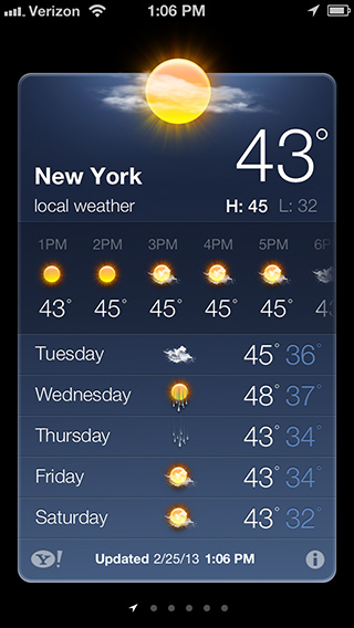
And then when I tapped the weather to get more details, it then said it was 43 degrees:
4. Hourly weather isn’t intuitive.
I love hourly weather. It’s what I rely on to get dressed, whether to bring an umbrella or not, or figure out the best time to walk the dog on the weekend.
I might just be getting old, but I just never found listing the temperature hour by hour in a grid that intuitive. I always had a nagging feeling that there could be a more seamless and more fluid way to understand and “get” hourly weather.
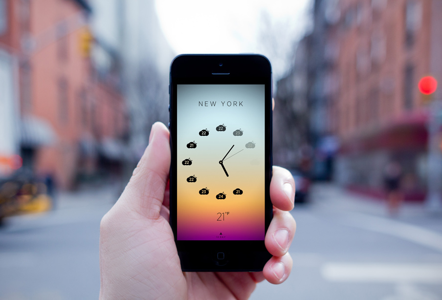
Analog Clock + Hourly Weather = Peanut Butter + Jelly
After sleeping on it a few nights, it hit me – why not combine an analog clock with hourly weather? It was the perfect match.
We all learn how to tell time on an analog clock growing up, and after years and years of looking at clocks, we intuitively know what part of the clock corresponds to what time of the day, even if it isn’t labeled.
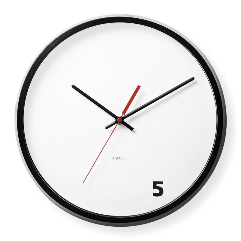
For example, the M&Co.’s classic 5 o’clock Clock cheekily only labels 5 o’clock, the most important time of the day – the time you get off work (although today’s version might more appropriately say 6 or 8 or midnight). The point is, you don’t really need o’clock labels at all.
So with Illustrator in tow, I began working on rough mockups:
The early mockups were way too visually cluttered. The point of combining an analog clock and hourly weather was to make things more seamless, not more complicated. The whole experience needed to be fluid and frictionless.
Or, to put it another way, I love infographic porn as much as any warm-blooded gal or guy:

via pinterest and wtfisonline.com
And while these infographics are impressive, they’re pretty much exactly what you don’t want from a weather app you use every day. The above infographics are meant to be studied and mulled over. Weather, however, should be obtained as quickly and easily as possible.
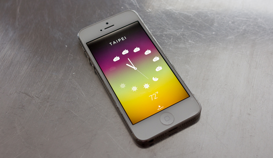
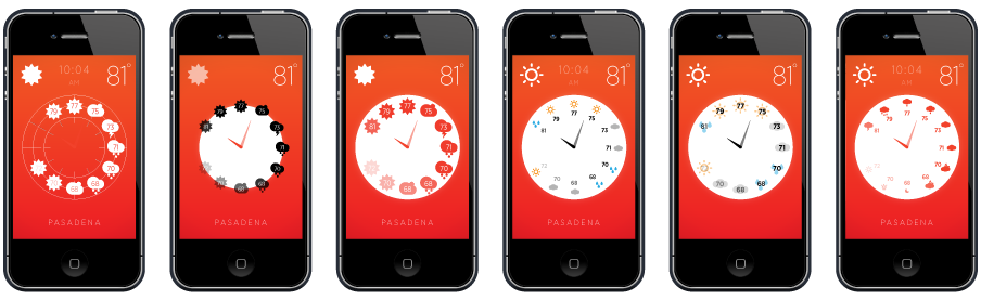
After some refinement, I settled upon the following basic design:
I was happy with this basic design because, overall, hourly weather just felt more intuitive. For example, if I want to know what the weather conditions are at lunch, right away I know that noon is the top-most icon, and that it’s going to be 77 and sunny (perfect weather for grabbing lunch outside at the chicken & rice cart). That might seem like a small difference from Apple’s weather app, which displays the same data in a column, but this process just seems more natural and easier to me.
I also find it easier to comprehend overall trends. For example, in the above picture, I get the sense that mid-to-late afternoon (i.e. the lower right side of the clock) it will be raining.
Nevertheless, improvements were needed. It wasn’t clear that this was a clock you were looking at. The solution was to add a moving second hand, which immediately signaled to the user that this is a clock.
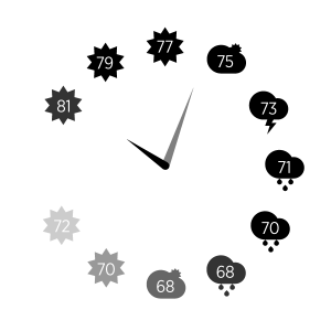
In addition, the icons weren’t quite right. With a minimum of 10 icons on the screen at all times, I wanted to express weather conditions in the simplest form possible to while maintaining a coherent aesthetic and readability. After many iterations, I settled upon icons in the bottom row:
![]()
The differences are subtle, but those subtle differences are magnified when laid upon the screen next to each other, and viewed daily.
As far as the app’s user flow, I wanted to build something that my mom easily could pick up and use. So I decided to stick mostly to Apple’s stock weather layout, a layout that most users are already familiar with – a single location per panel, with swiping left and right for different locations. It also always felt odd to me that Apple weather’s settings were on the back of every single location panel, so instead I moved the settings to the last panel on the left. There are some trade offs to this method, but overall I like the spacial/mental model it creates: one panel = one main focus.
Lastly, there were the backround gradients. Clear and then SoLAR are the originators of this style. It’s a good solution when it comes to representing the current weather conditions and temperature. Some other weather apps display actual photos, but unless they’re showing live photos (which they’re not), you end up in a sort of uncanny valley, where the photos are meant to concretely represent the current weather, but they’re actually just approximations. Gradients are a great way to capture the feeling of the sky and temperature without being too literal.

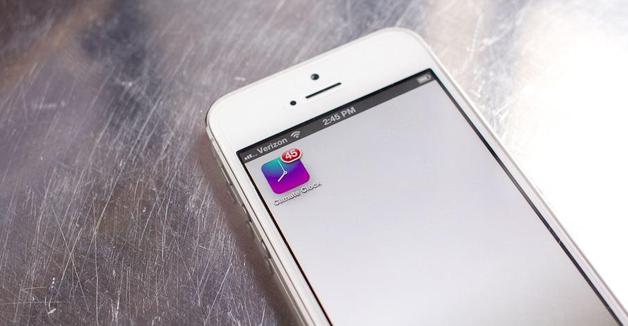
One thing I really wanted to include was the current temperature as an app icon badge. Unfortunately this wasn’t as simple as it sounded – it meant building a push server that actively retrieved and sent the current temperature for every single user. It was worth it, though – I really love having the current temperature available all the time without having to open the app, or swipe, or do anything! It’s become one of my favorite features, and I hope users love it as well.
I decided not to include additional features such as radar, barometric pressure, etc. I know some power users and weekend warriors use that info, but I wanted to focus on creating the most streamlined experience possible for the majority of users.
Lastly, motion and animation were added to create a feeling of responsiveness. You can get a good sense of it in this video:
I hope you enjoy using the app as much as I’ve enjoyed building it. Please feel free towith any feedback or suggestions.
See Climate Clock on the App Store »
See ClimateClockApp.com »